




Planning a trip for oneself or a family/group takes into account of many different factors. These factors are the type of trip, activities, transportation, and costs. All of which relate back to whether the budget allows for the desired experience. There are various logistics in planning a trip but being aware of the amount of financial liberty a traveler has, helps to alleviate a big part of the trip planning stress.

Planning a trip, of any type, can be difficult financially when trying to constantly be mindful of staying within budget.

We want to know what has priority on a trip so that we can help people stay within budget to bring the desired trip into reality.


Let's take a look at what goes into the budget when traveling. Below are the average costs traveling in 2022.
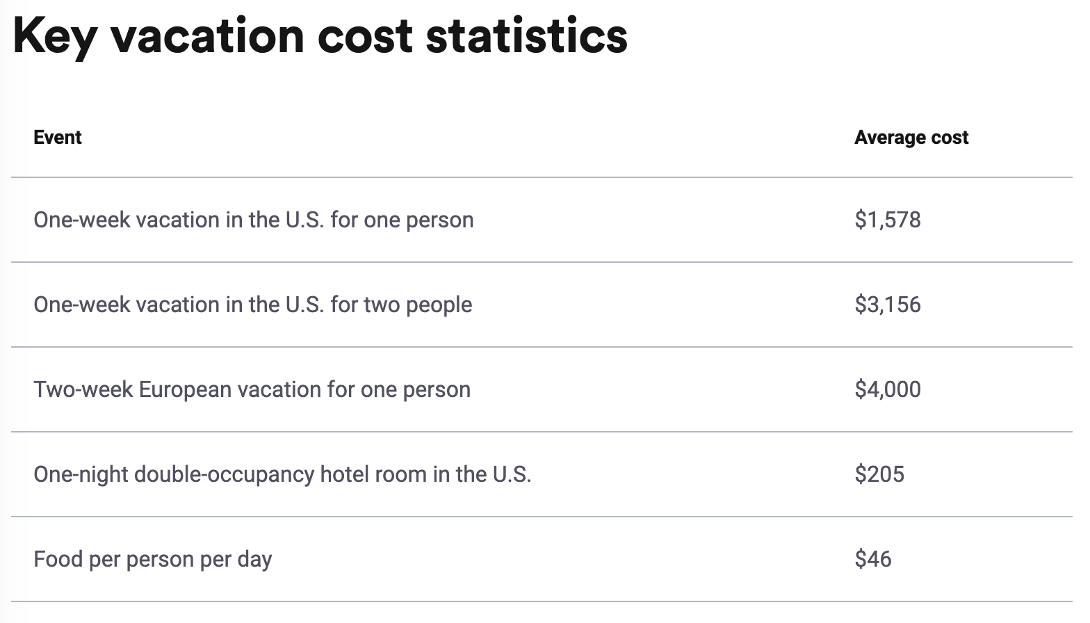
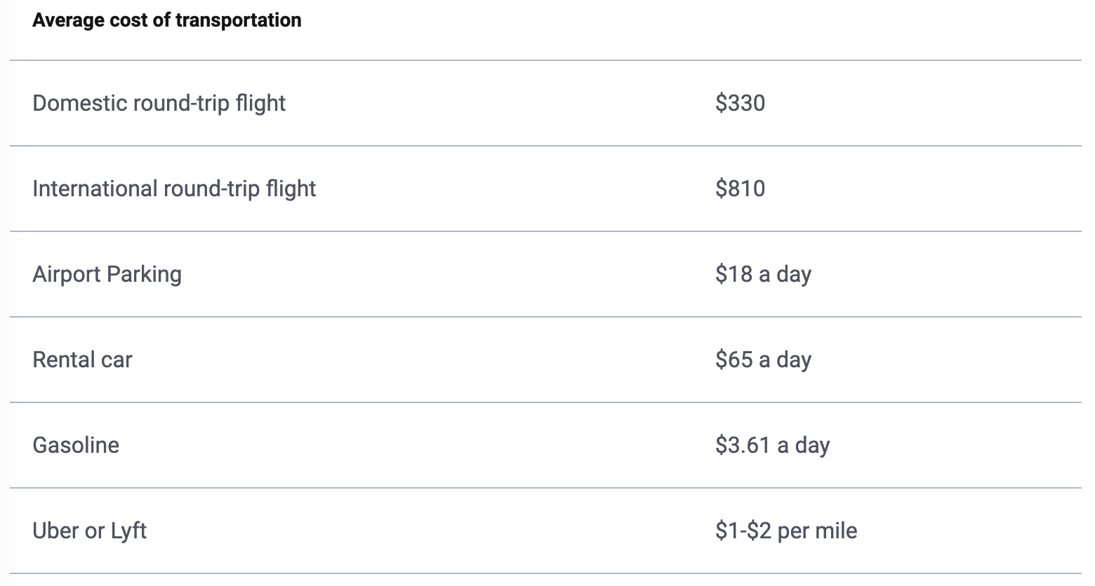
In the times of soaring inflation, the average cost of trips or vacations can be expensive. As shown above, the costs may be more or less depending on what activities travelers partake in and the type of trip they want to have, whether it be a relaxed or luxurious one. In most cases, housing and transportation take a big chunk out of vacation savings.
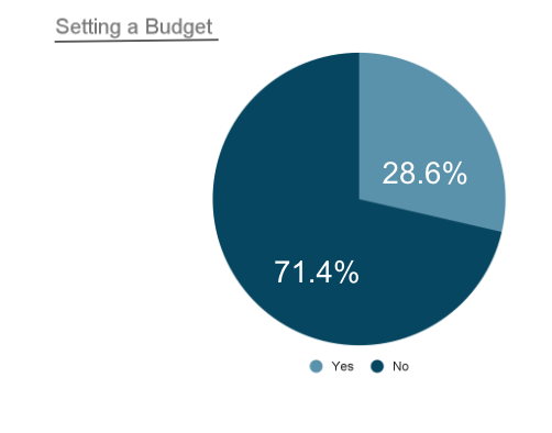
Participants consist of people who have planned or traveled for a trip within the last 6 months and have set a budget before. Planning can be financially difficult and we want to assess how people approach planning with a budget.


The results were surprising given that 71.4% of participants do not set a budget when traveling. Of that percentage, they could also possibly fall within the category of traveling once every 3-6 months. Although not everyone places budget of high importance, to the remainder of the participants, it still plays a key factor in trip planning.
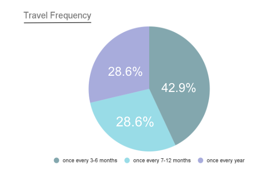
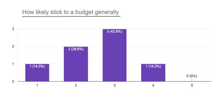
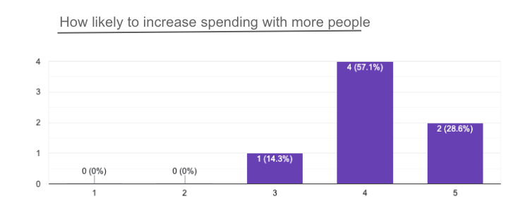
Participants took into consideration of occasion, destination, deals, and group preferences equally or more than the budget.
With more people, the budget is larger for group activities compared to a solo trip. 100% of participants support the idea of increasing their budget within a group
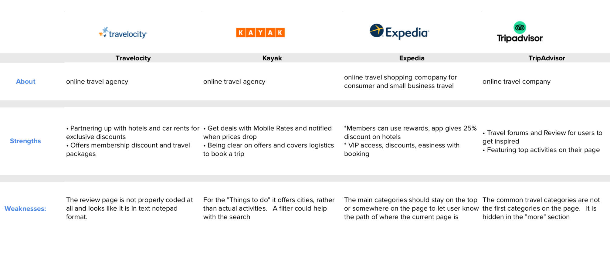
Before diving into creating the elements and functionalities of the application, I conducted a competitive analysis of what the market is offering. Below are 4 different applications that are travel agencies in the service of trip planning. Upon completing the research of options available, there are characteristics that I envisioned as opportunities for my application.

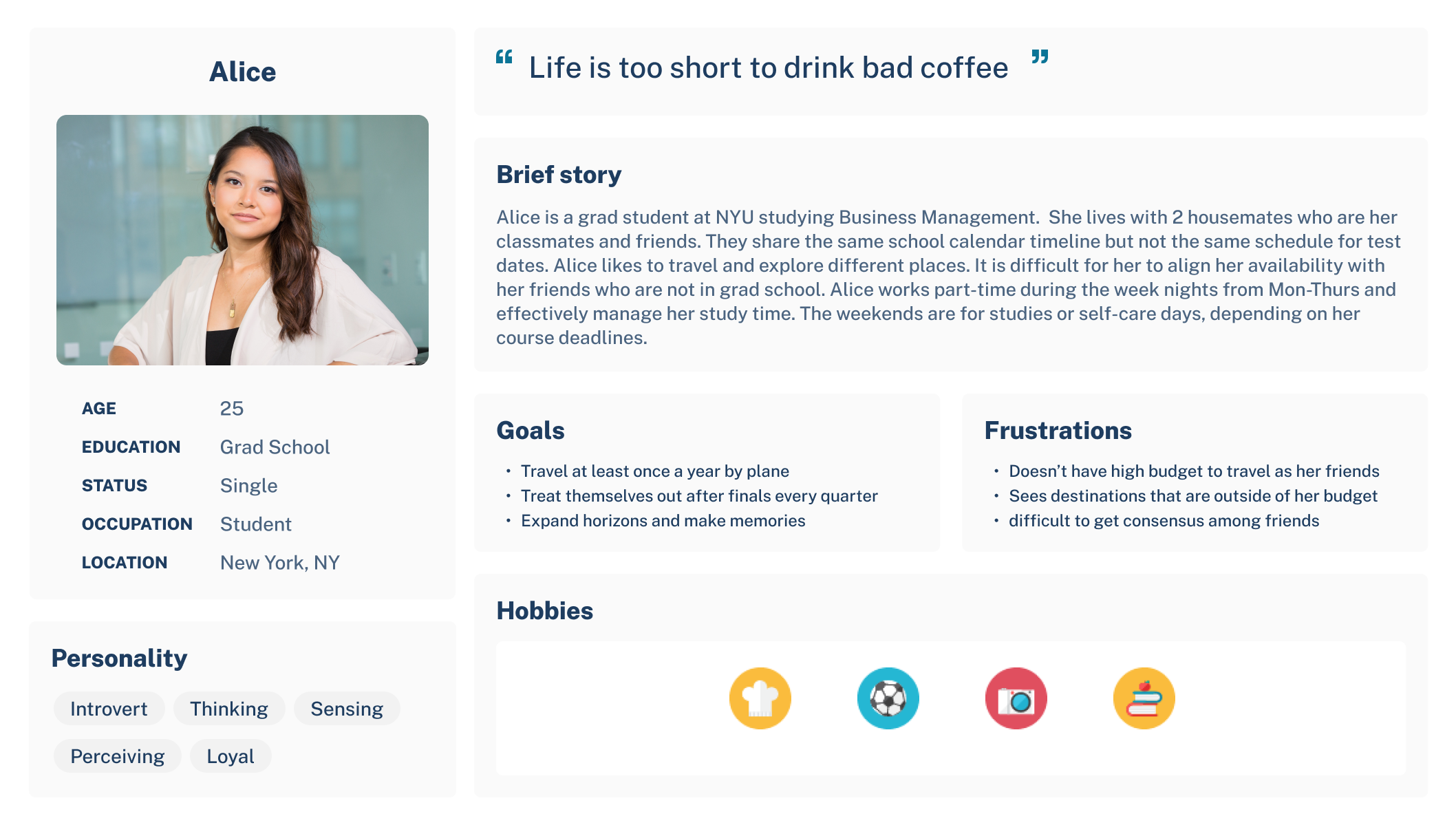
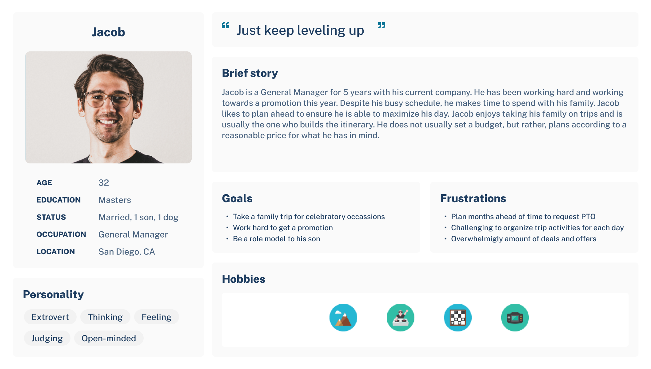
The personas created are focused on people who travel and have to be mindful of their expenses. In both scenarios, it highlights the importance of being aware of one's financial situation and planning accordingly with others.

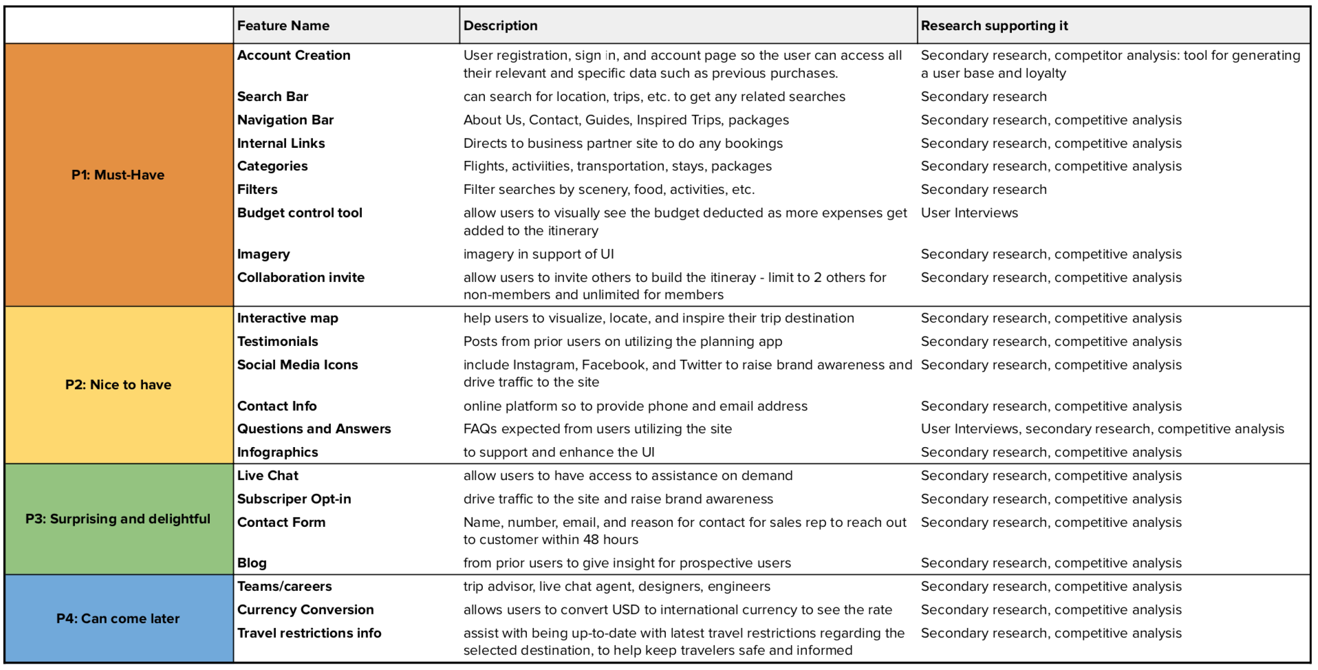
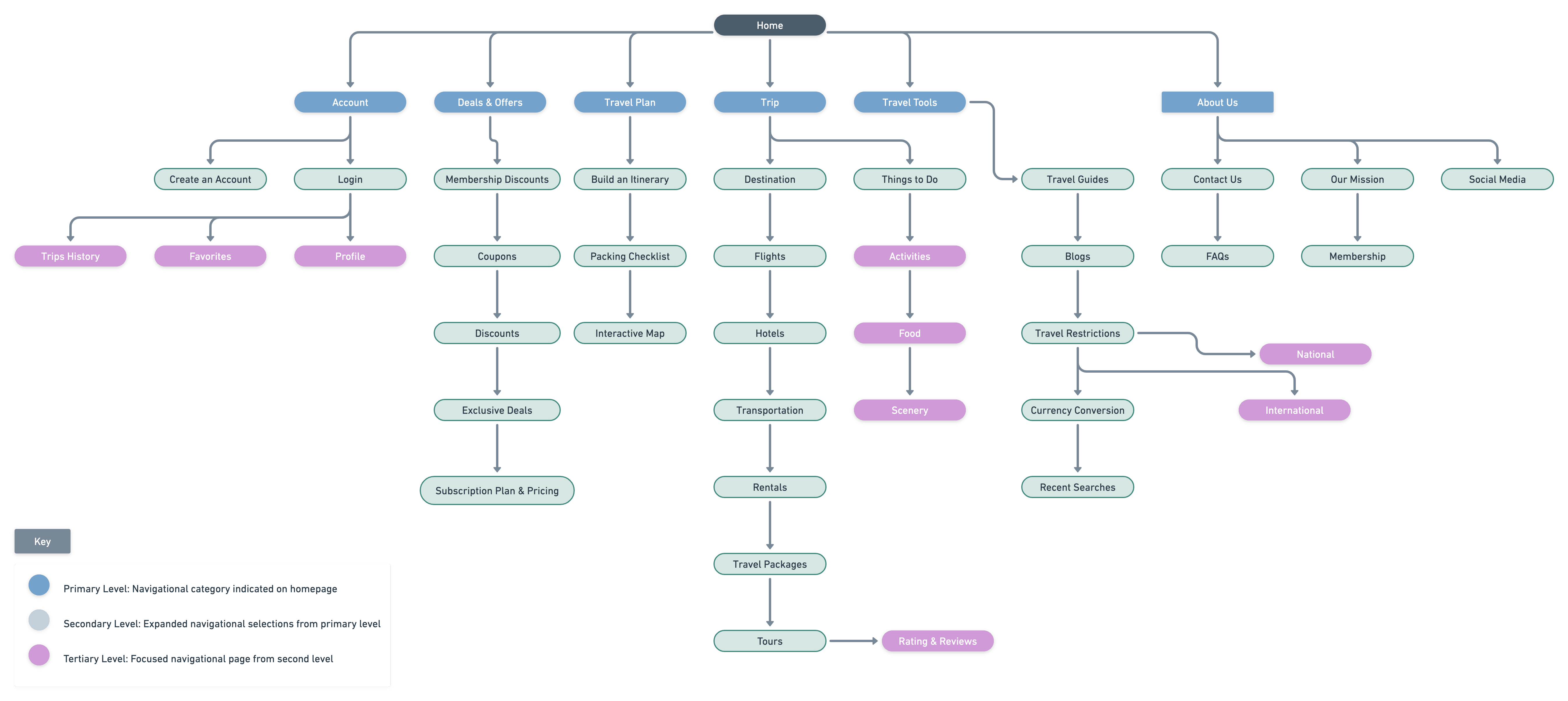
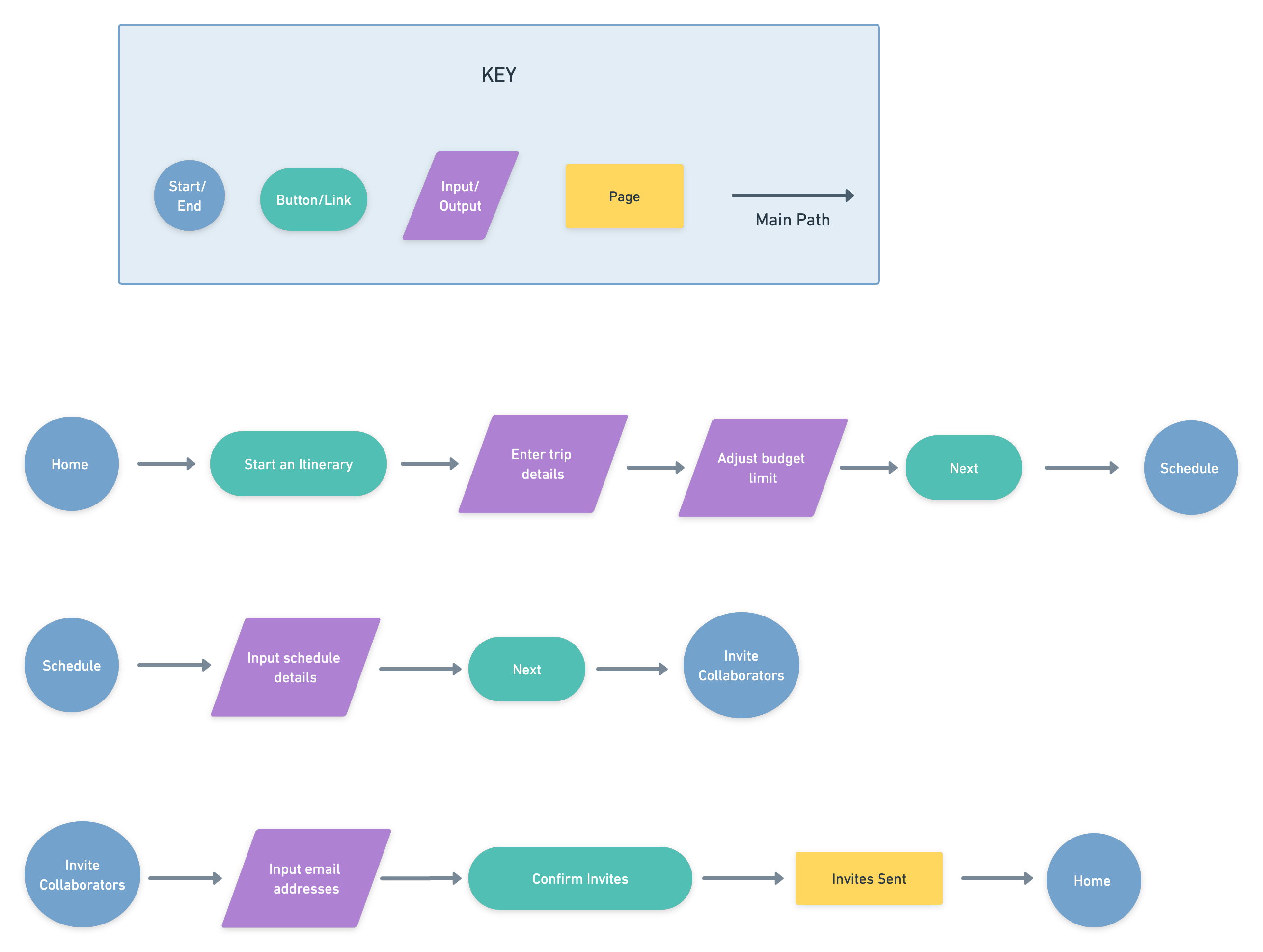
Relevant features were identified through competitor analysis and secondary research. Aside from the typical pages, the similar pages as competitors are produced to create a familiar sense as a user is browsing and comparing their options.
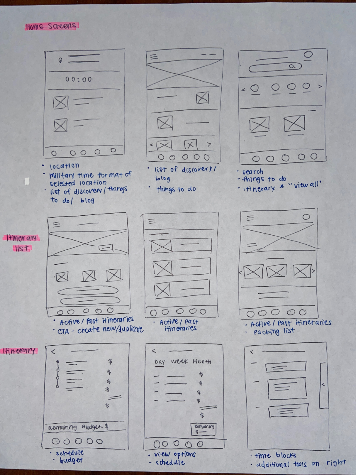
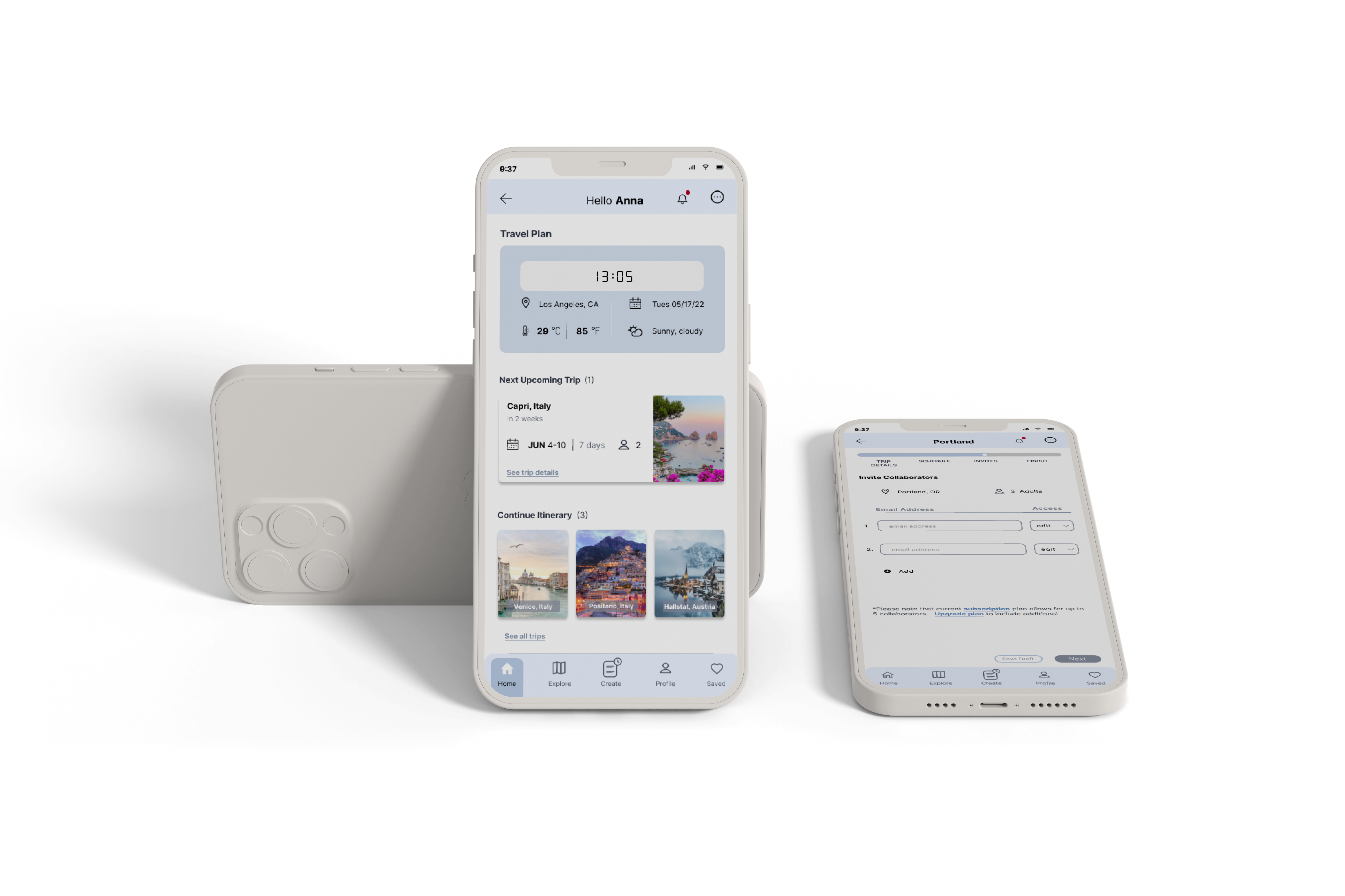
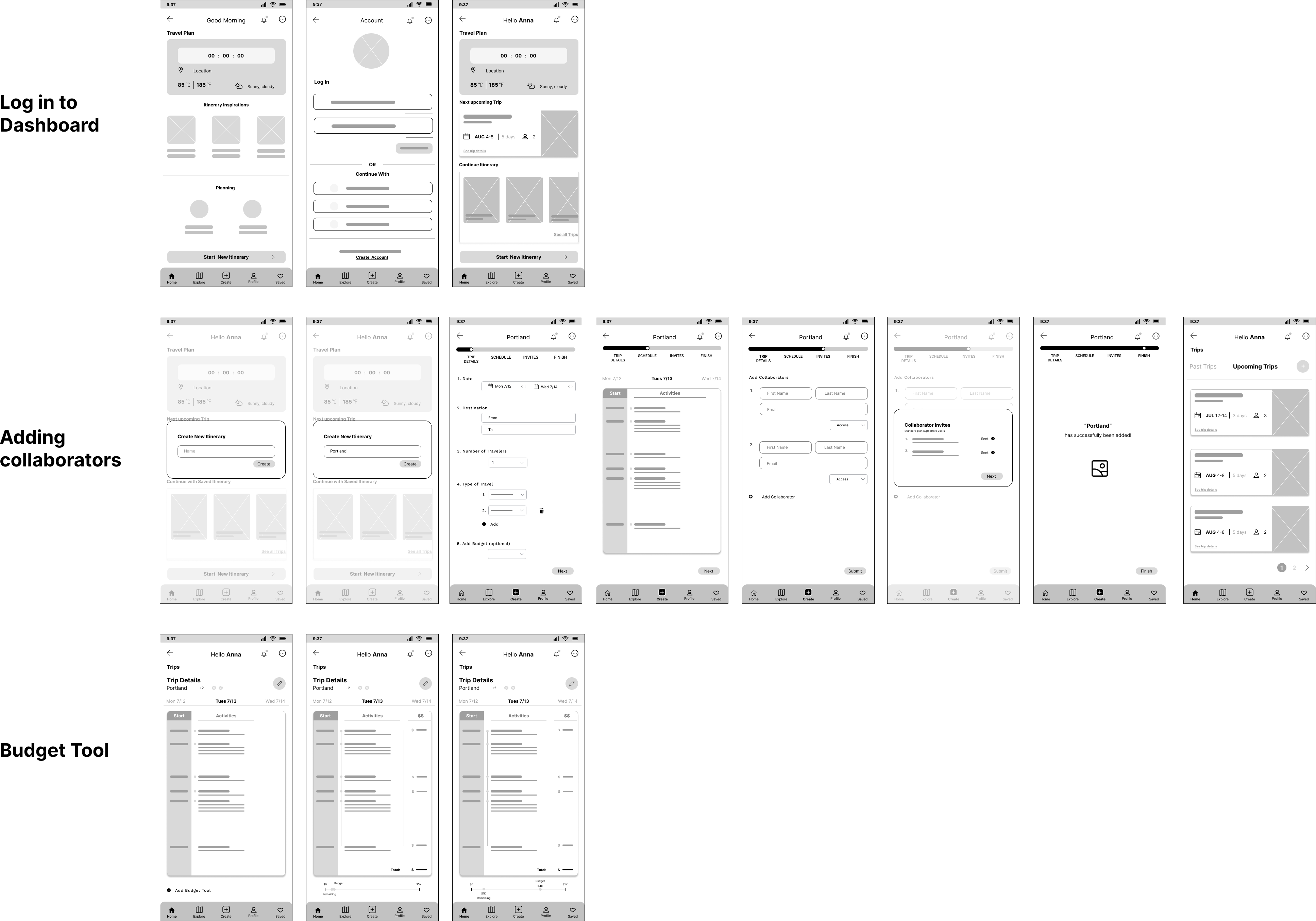
The homepage captures the ideation from homepage layouts to itineraries list through the schedule. The inspiration is from other itinerary creation apps to enhance readily available features for users when planning for a trip.
Next, time to refine, organize, and assemble.
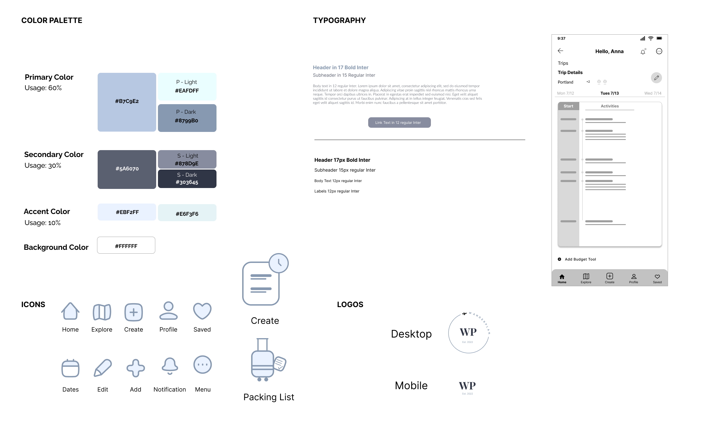
The color palette was curated to create the impression of calmness and serenity. Additionally, the typography supplements the app in terms of simplicity and clarity. Components and icons were explored to ensure the relativity towards the brand design. The two "Create" and "Packing list" icons were custom designed to match the aesthetics of the icon set. Lastly, I wanted to capture the essence of travel. The desktop logo has a plane to indicate the path of travel as one goes from place to place.
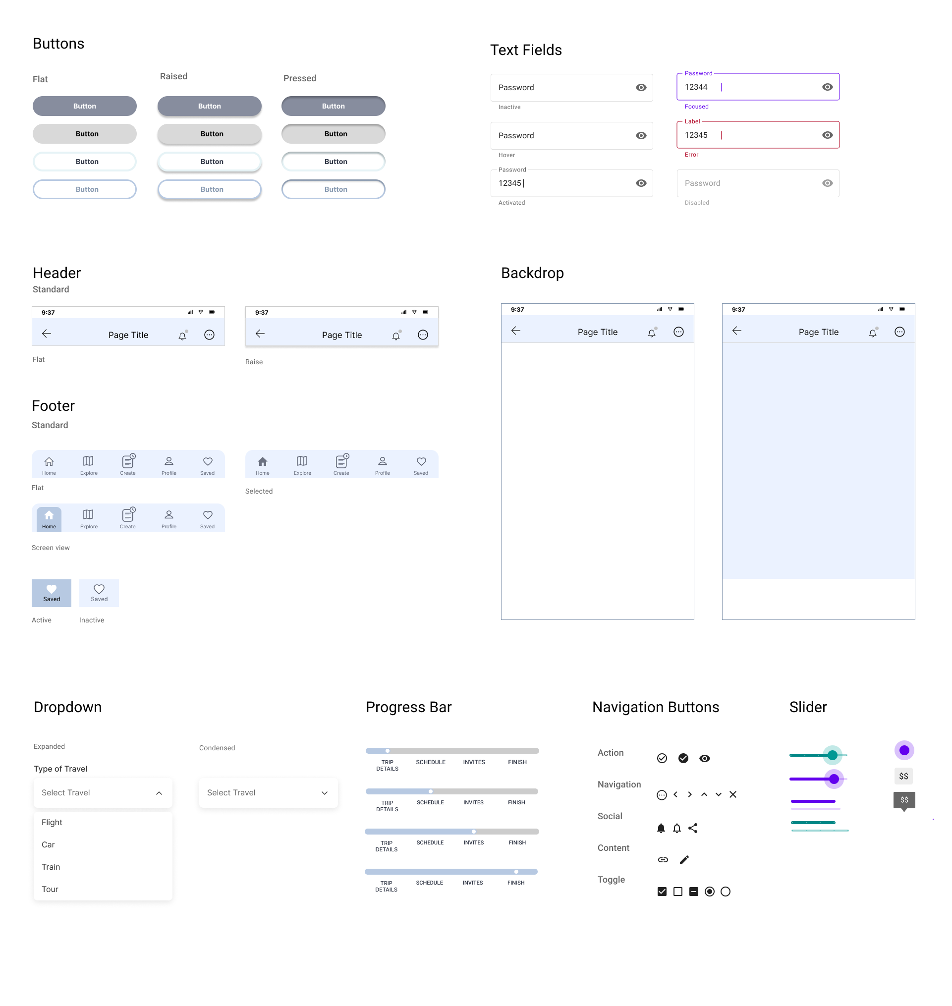
Different variations of components are designed by incorporating the color palette and typography. The design patterns are displayed through the dropdown, button displays, and progress bar.
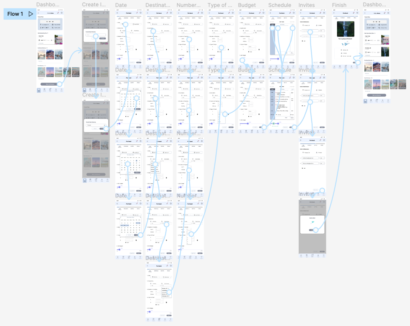
A usability study was conducted with participants within LA county who have planned an itinerary before. This includes full-time and part-time workers and students.
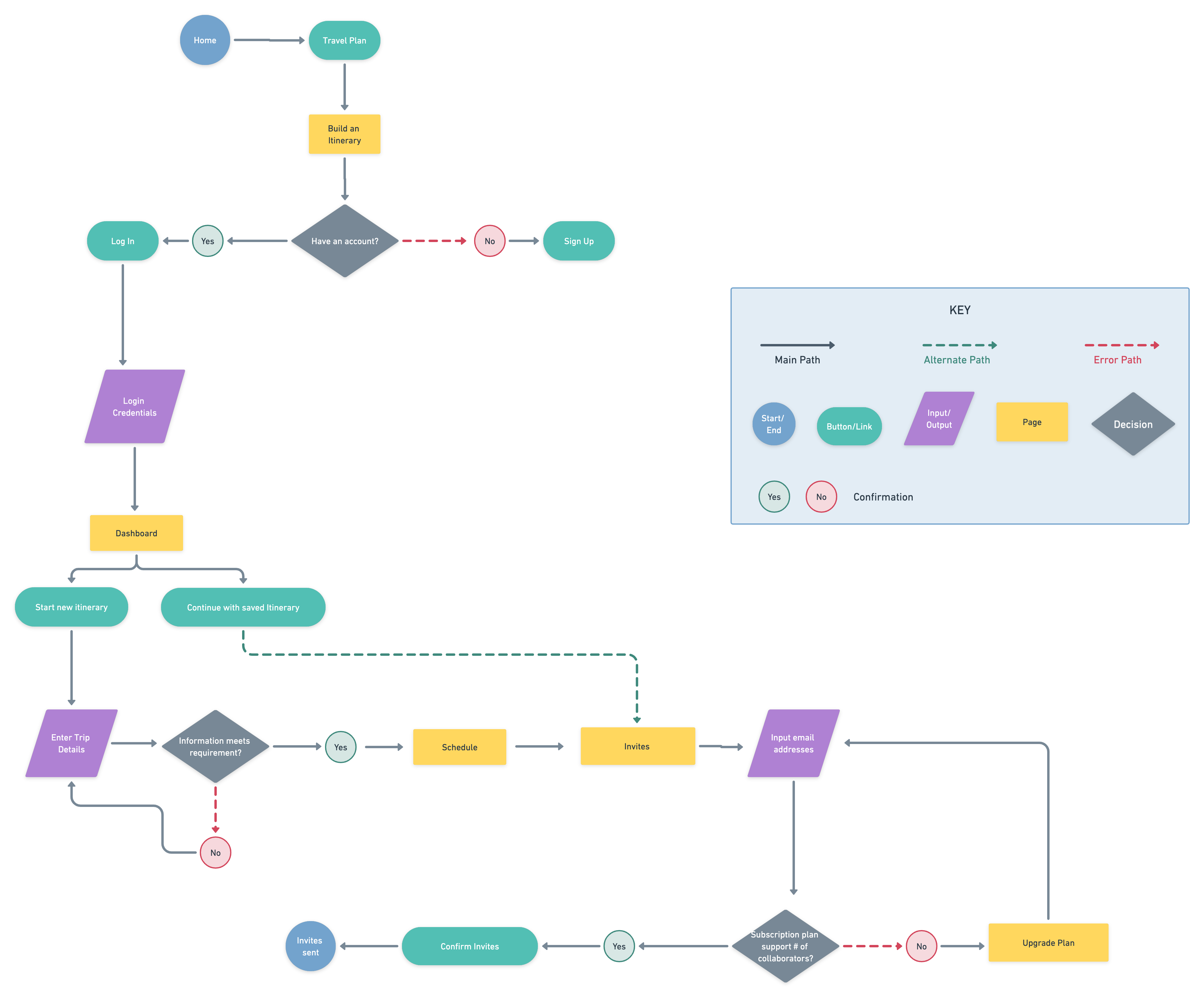
We’re creating a new app to help people invite their friends to create an itinerary together. Before launching, we need to figure out if inviting collaborators and setting a budget is easy for users to do. We’d like to understand what specific challenges or needs users might face in the creating process and how to resolve issues identified.
Figure out if users can complete the core tasks within the app.
There were more updates needed than expected. The areas that require improvement to enhance effective functionality are intuitiveness on CTA button, guidance on form requirements, and visual elements.
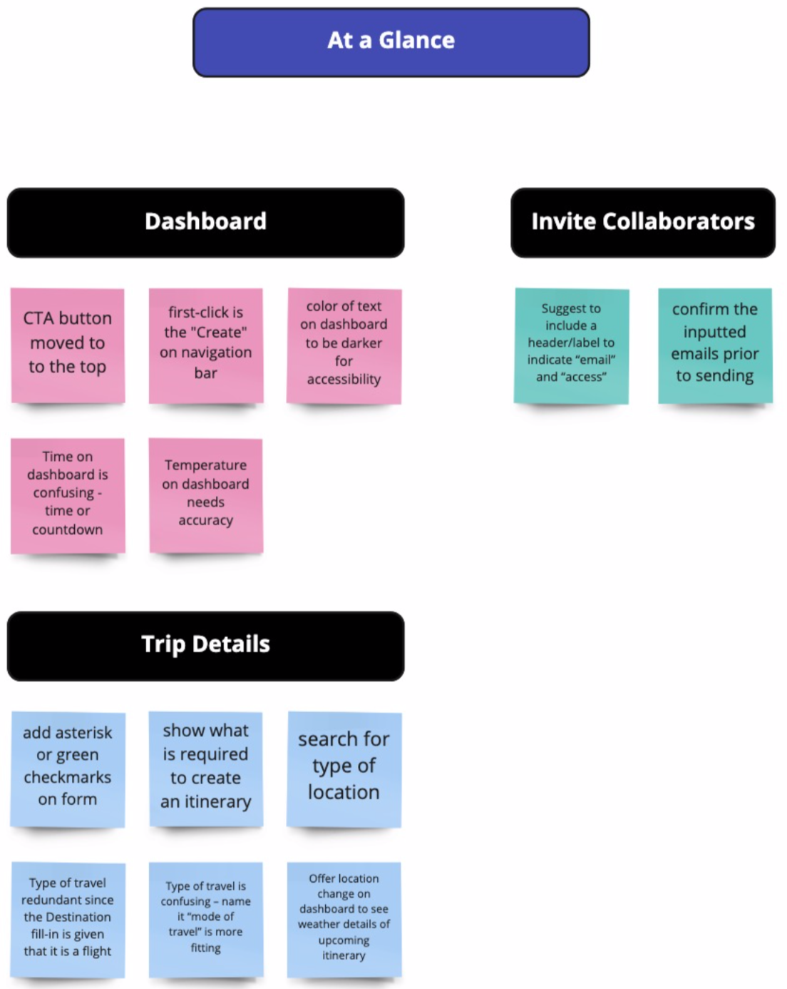
• Indicate required fields when creating itinerary details
• Allow users to confirm email addresses before sending
• Update military time on home page to digital time font
• Indicate location instead of airport on details screen
• second point of entry for creating itinerary
• Darker text on dashboard
• Update temperature accuracy
• Offer location change on weather details
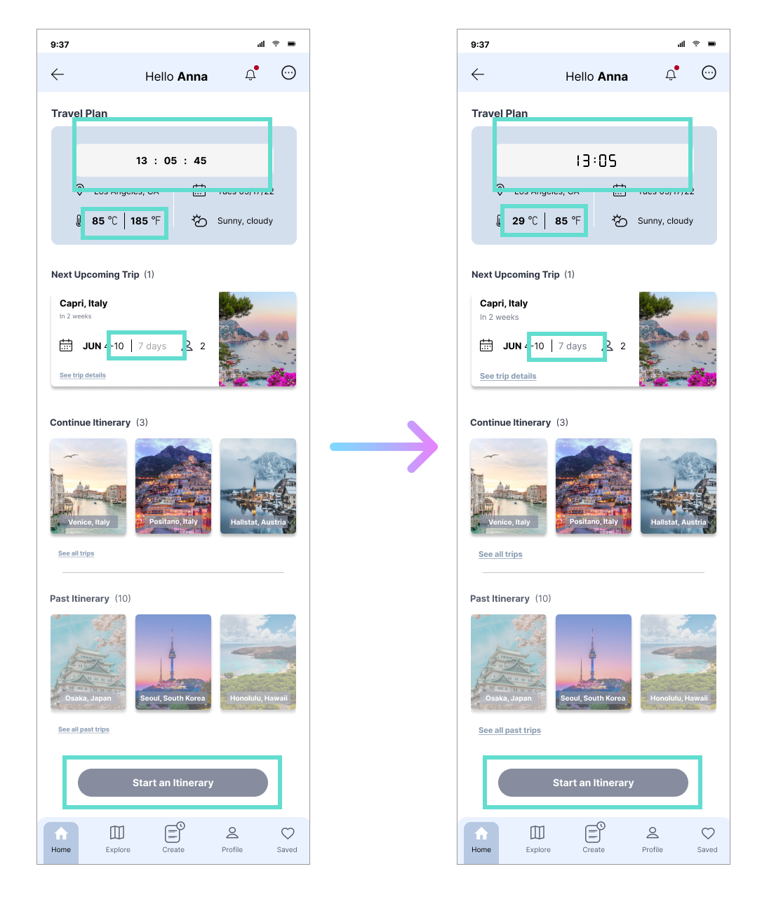
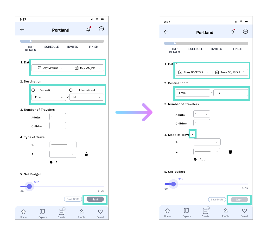
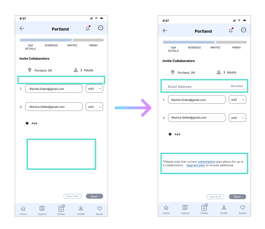
.png)
• Added invites confirmation screen


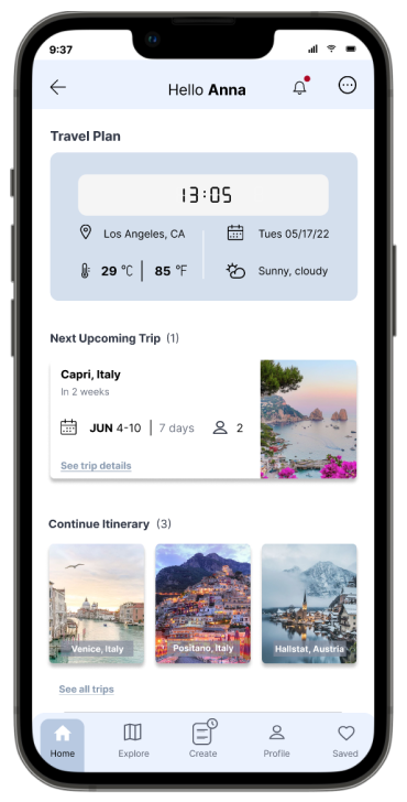
Being the designer I was able to identify flaws and other small nuances in the design. Perfection is equally attainable and unattainable. I have learned to detach from my project when I have put in the effort to make it as presentable and user-friendly as possible. I have learned to trust the process in allowing research participants provide a different perspective on what areas of improvement the design needs because ultimately it is intended for them.
From one app to another there are many similarity and patterns that can be compared. I revised and focused on existing design patterns to maintain the modern features of the app. This is crucial to keeping up and staying competitive in the market to better cater towards target audiences.
.png)


