


The Home Unite Us project is developing a workflow management tool for community nonprofits to automate and scale their existing Host Home initiatives, prioritizing streamlining of caseworkers' repetitive workloads, reducing institutional bias, and effectively capturing crucial data.
Host Home programs are centered around housing young people, 18 - 25 years old. Their approach focuses on low-cost, community-driven intervention by matching a willing host with a guest or group of guests, providing a stable housing environment for youths who are experiencing homelessness and seeking stable housing.
This project is being built by a team of volunteers though the Hack for LA organization.
This project involves three personas. My initial focus upon joining was wireframing the Guest Flow. I collaborated with the UX Design Lead and two other UX designers, with each of us taking responsibility for a specific flow.
My initial contribution to the team focused on designing the flow for the guest profile form. This profile enables guests to provide information about themselves, allowing coordinators to identify a suitable host—who completes their own form—and facilitate a successful match between the two parties.
After being on the team for around seven months, the project went through a restructure. The Guest flow was transferred to another volunteer, and I took on the Host flow.
Youths ages 18-25 who are experiencing homelessness and seeking stable housing
Willing hosts to provide a stable housing environment
Caseworker reviews guest and host profiles to create suitable matches
Guests, youths aged 18-25 experiencing homelessness, need a way to share their information with the matching organization and Hosts to be considered for the housing match process.
As a Guest, I should be able to view the questions in the Profile and complete them to the best of my ability for the matching process.
There would be a Profile page featuring multiple questions with corresponding fields for entering answers. The page should include functionality such as a "Save" option and the ability to navigate seamlessly between different sections of the profile.


The initial focus was on the mobile application. To ensure familiarity for the target audience, we researched patterns and ideas of navigational design and incorporated those insights into our approach
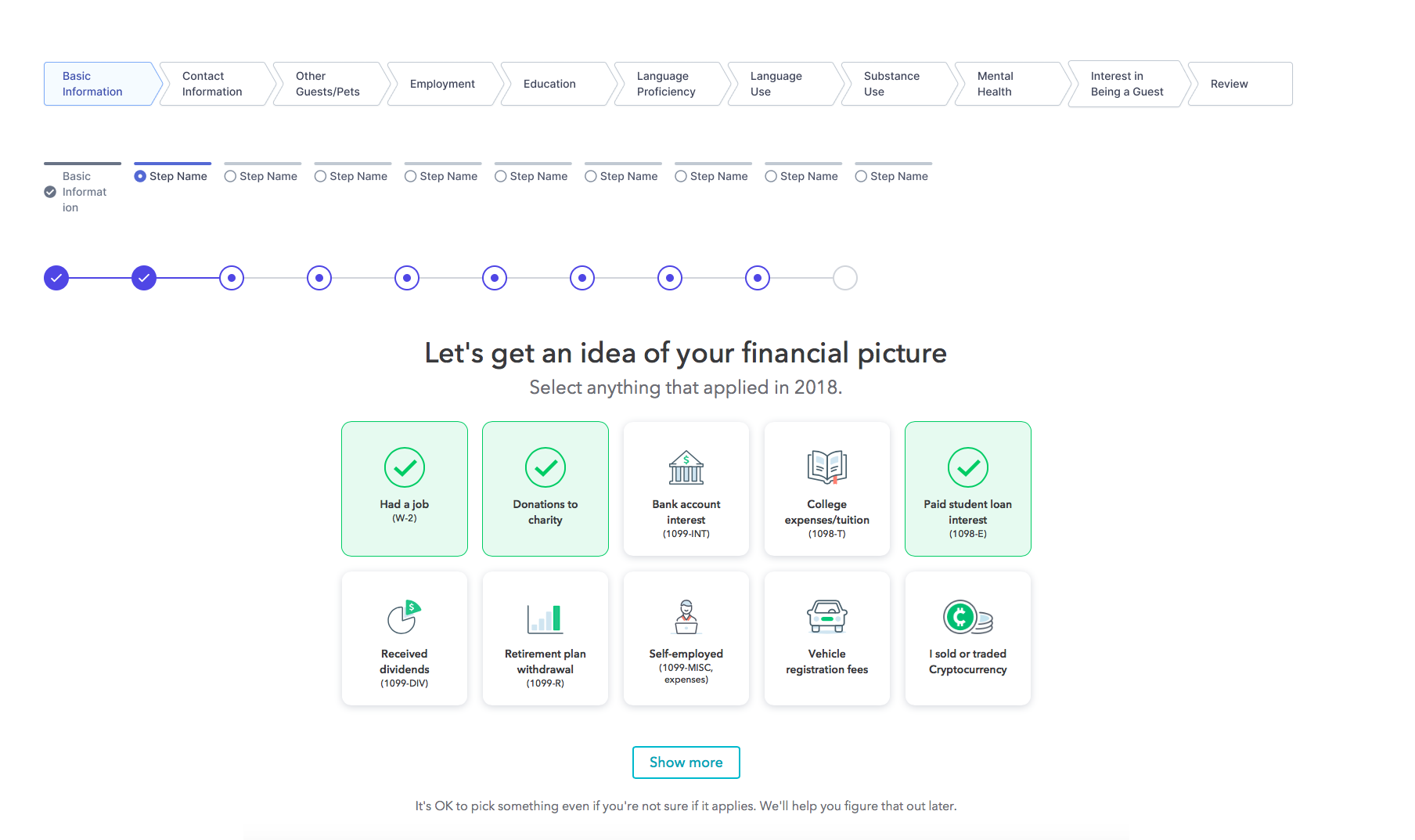
The key elements we focused on included designs that: clearly indicate user progress, allow users to modify their answers and navigate to any section of the profile, and provide a final overall preview before submission.
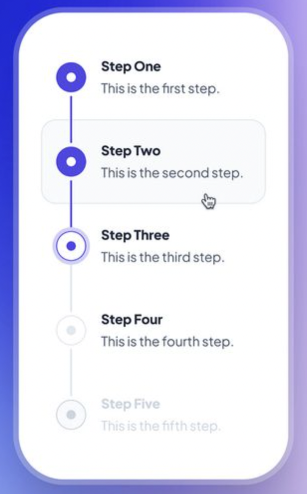
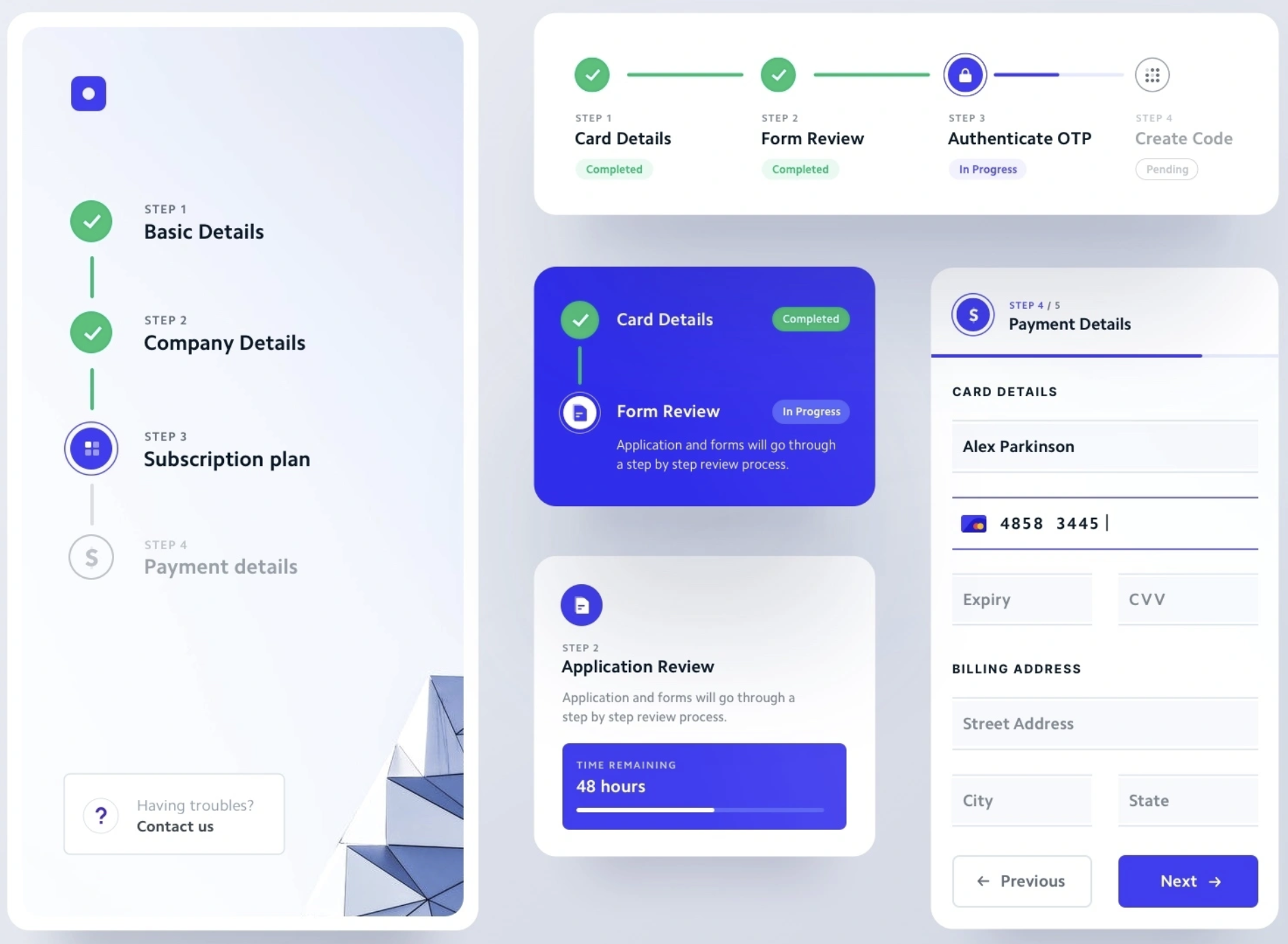
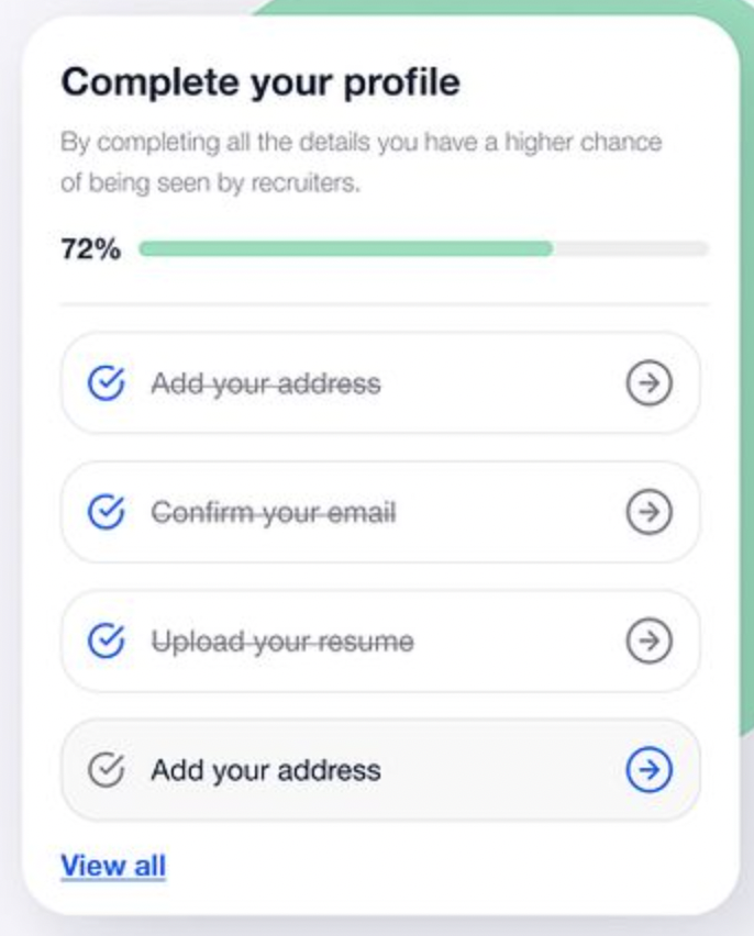
One major difference is that the current flow does not indicate the user’s position within the profile, leaving them uncertain about their progress. By labeling pages and marking completed sections, the improved flow clearly communicates how much remains before the profile can be submitted.
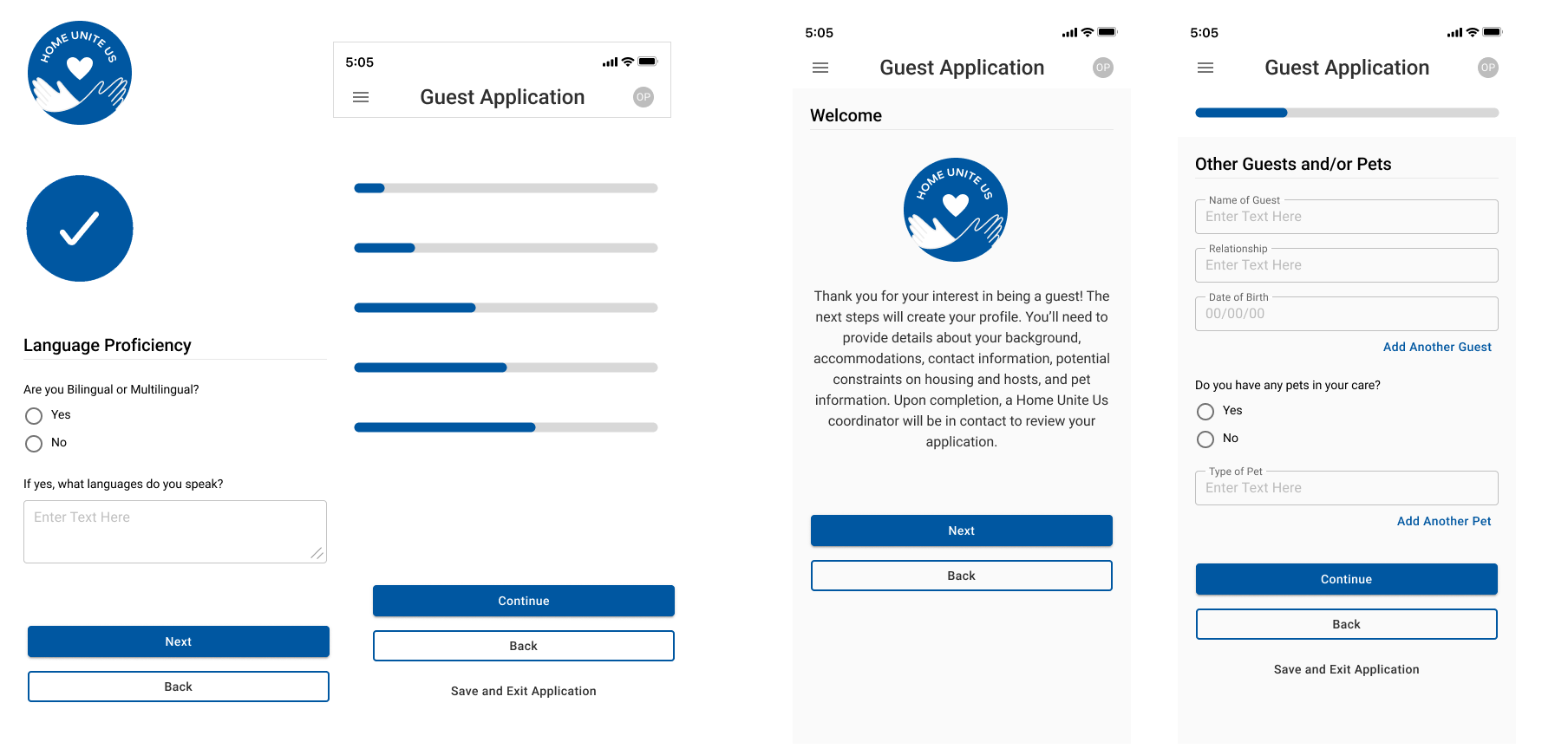
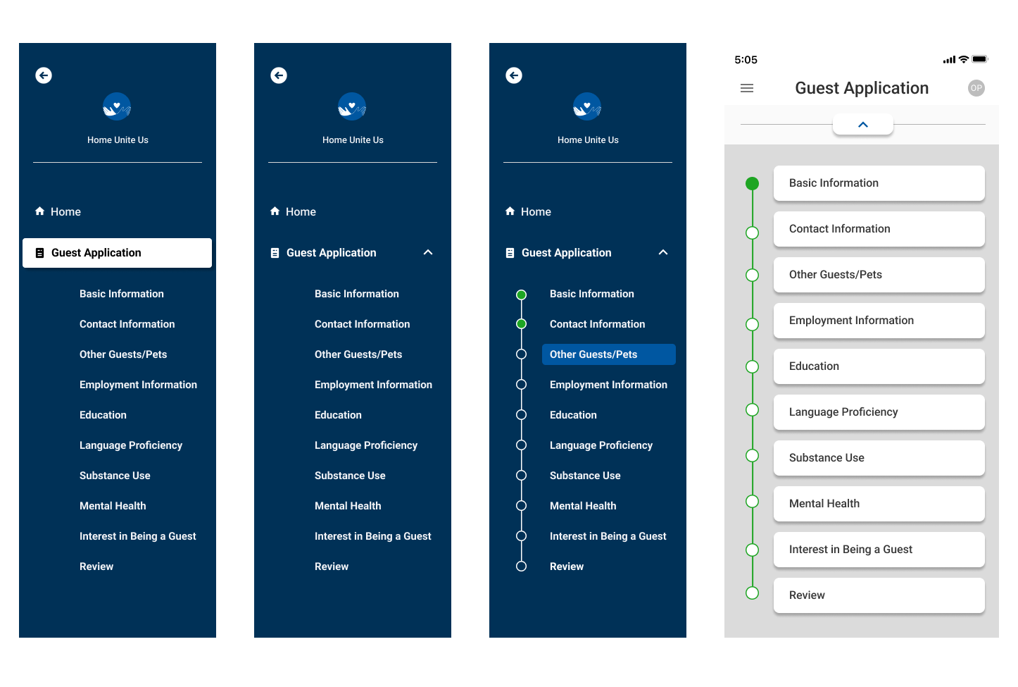
Joining a project already in progress meant working within an established structure. Adjusting the design style for enhancements was straightforward, as the design system was already in place, complete with existing features. However, as I worked through the flow, I identified areas that required design adjustments to better align with the high-level approach and key considerations. While making these changes, I remained mindful of maintaining consistency by ensuring alignment with the existing style and tone of the current flow.
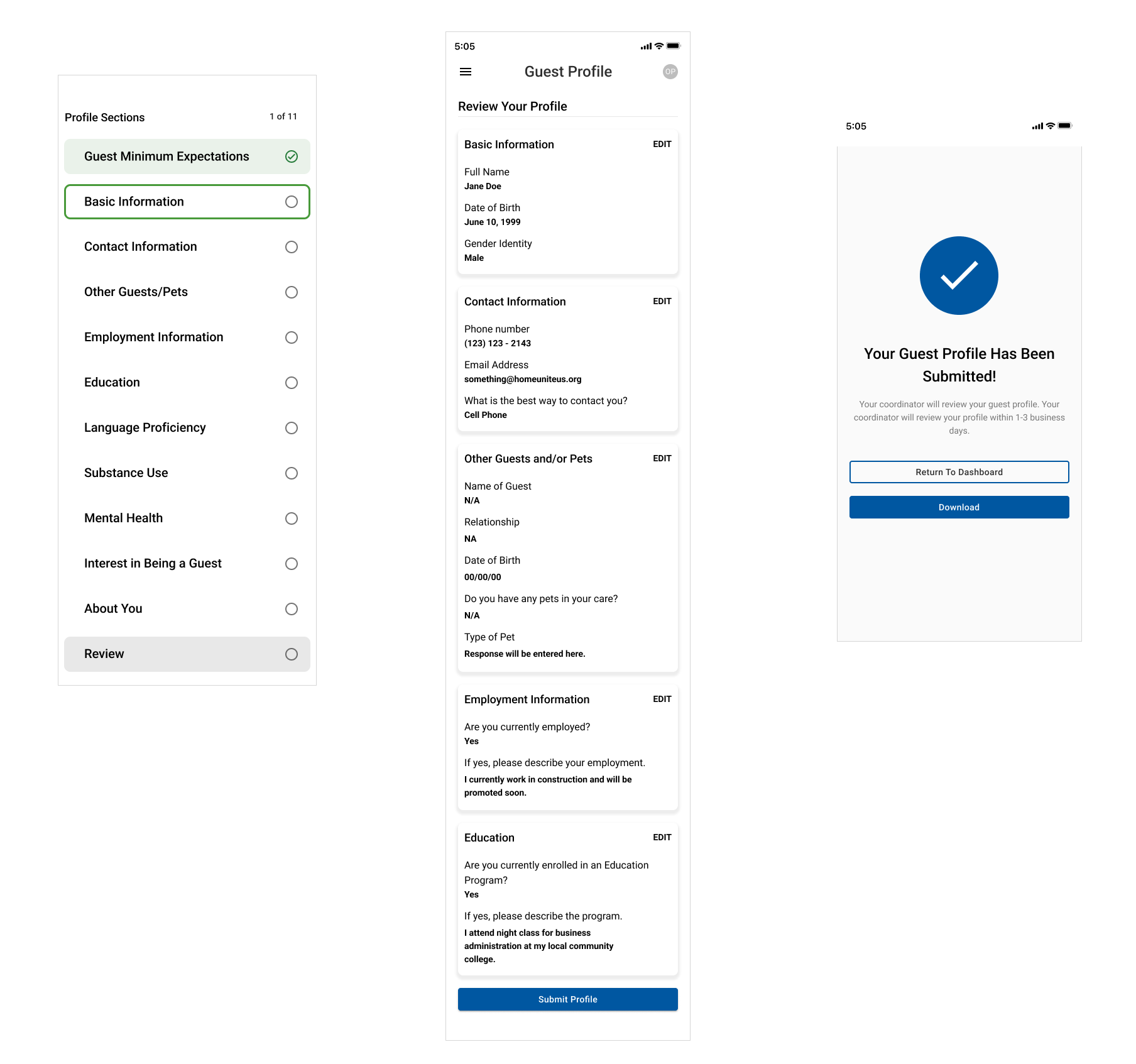
The initial flow included a progress bar but did not allow users to view all the sections they would encounter while filling out the profile. Additionally, the progress bar was removed as it created the impression that the form had to be completed in a linear order. Given the young adult demographic, it was crucial to consider cognitive load and attention span on each screen. To ease anticipation and improve transparency, the updated flow organizes profile sections in a way that gives users more control over navigation, allowing them to move freely between sections while clearly tracking their progress.
As users complete each profile section, a green checkmark will appear in the profile section list. The Review section will remain locked, indicated by a lock icon, until all profile sections are completed. This serves as a validation checkpoint for both the app and the user, ensuring all required information is provided before proceeding.
The guest profile flow was designed to align with key features and meet the acceptance criteria. While the navigation underwent significant changes, the questions and elements within each section remained unchanged.


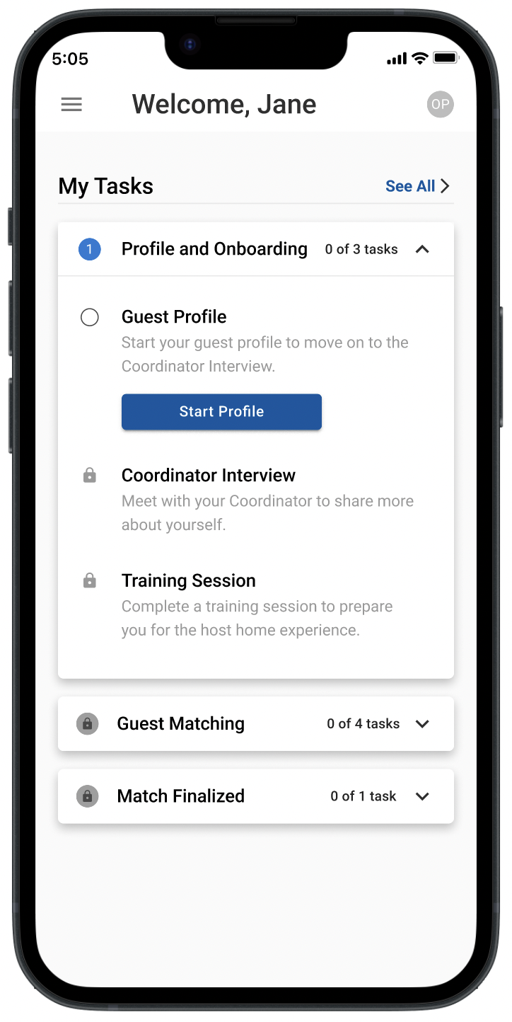
Please note that, given the numerous ways users may navigate between pages, a condensed list of profile sections is provided to illustrate the complete flow.
While some screens require yes/no questions, others rely on free-response inputs. The need for free responses led to the introduction of an auto-save feature to ensure answers are saved. However, determining when auto-save should activate raises questions—should a half-filled page trigger a save, or only fully completed responses? These nuances require careful consideration to balance user convenience and data integrity.
Willing hosts need a way to share their information with the matching organization to be considered for the housing match process and show they can provide a stable living environment.
As a Host, I want to track my application status and any required meetings so I can move forward with the matching process.
Along with a profile form, the flow includes a status page that highlights key steps, progress, and the host application status, plus a right sidebar with action items, upcoming events, and Coordinator details.
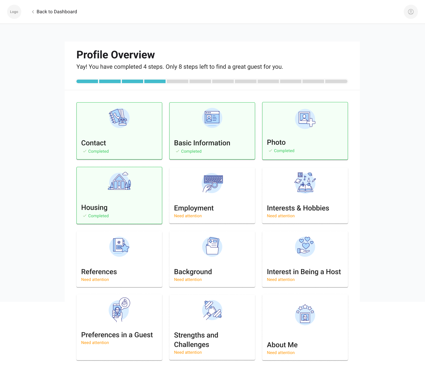
The project was restructured to start the Host flow with a desktop web app design, creating an opportunity to explore the best navigation style and pattern for users completing their profiles. The optimal design should clearly indicate the user's current step, progress made, and remaining sections to be filled out.
The team chose a card-style sections list, as it effectively addressed key features essential to the Host user flow. Additionally, this design is scalable, allowing for future expansion if more sections need to be added. Below are four different ways to arrange the section list. Each follows the same pattern, but incorporating icons makes the profile feel more inviting and visually appealing.
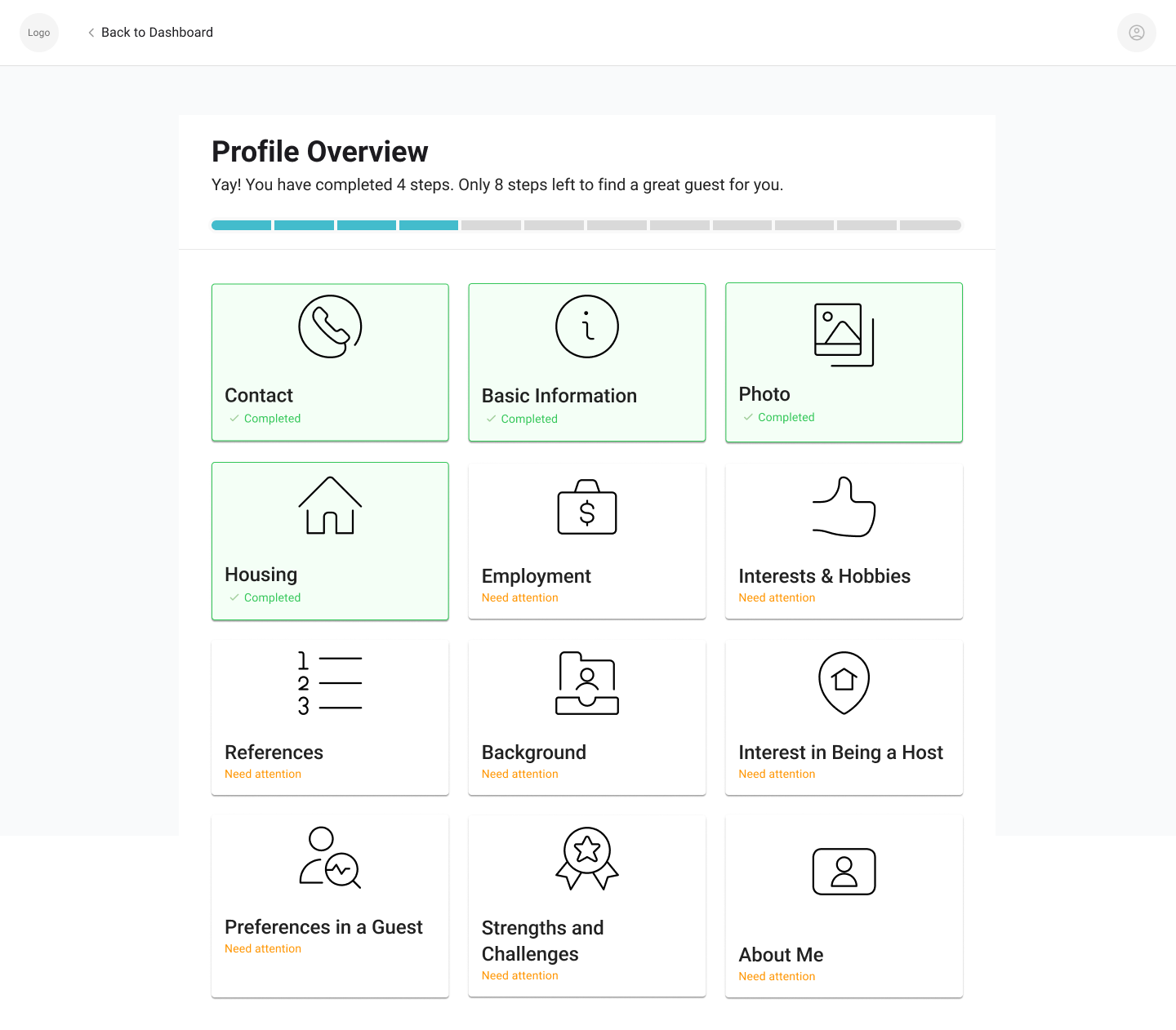
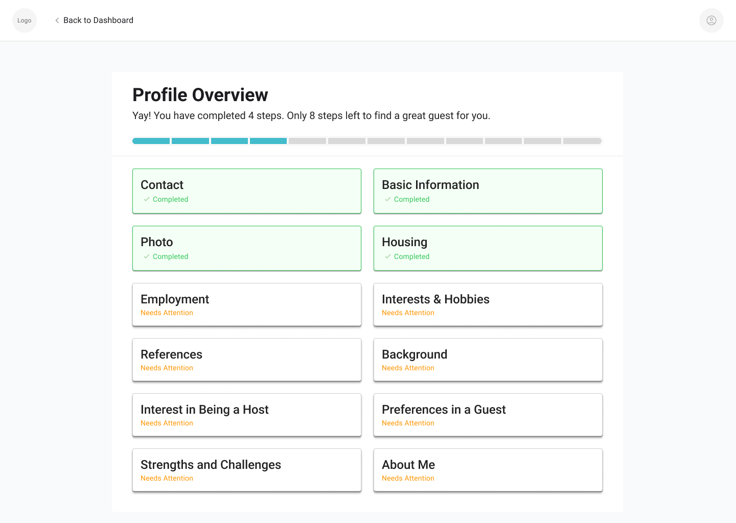
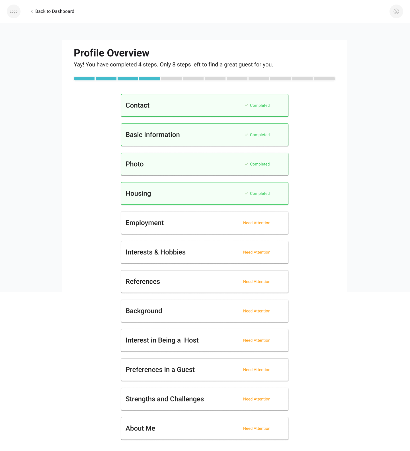
When designing for desktop, there's plenty of screen space to work with. The challenge is finding the right balance—using enough space to enhance the flow without overwhelming or underutilizing the layout.
Critiques have been a valuable tool for learning and growing in my design process. I’ve come to view feedback as an essential part of refining my work and advancing to the next stage. It’s not always easy to hear criticism, but I’ve learned to approach it with an open mind, knowing that it brings me closer to a more polished and effective design.
On the flip side, I’ve also learned how important it is to be an active listener when my teammates present their work. It’s crucial to absorb their thoughts fully, ask thoughtful questions, and provide feedback that’s relevant to what they’re seeking. Instead of offering feedback just for the sake of it, I now focus on what they’ve specifically asked for, ensuring that my input is both valuable and actionable.
Working on a project alongside both a design team and an engineering team has been a huge learning experience. I’ve gained a deeper understanding of how even the smallest design choices—like an icon or a specific function—can significantly impact how the engineering team approaches development. Some designs that initially seemed great from a UX perspective turned out to be less feasible when considering technical constraints and development timelines. This experience has taught me the importance of balancing creativity with practicality, ensuring that designs are not only user-friendly but also efficient to implement. Collaborating closely with engineers has helped me refine my approach, making sure my design decisions align with both user needs and technical feasibility.

